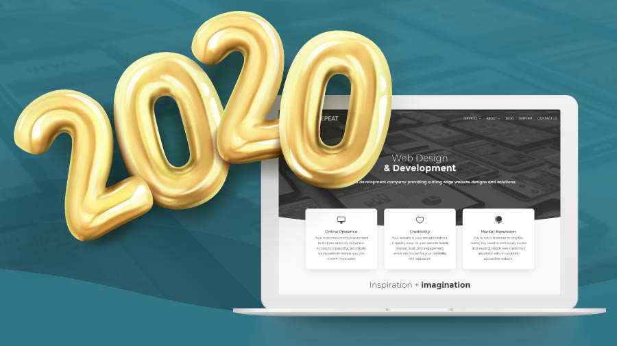
Like every industry, from fashion to film and everything in-between, the web development industry is always changing. With every new year, trends shift and new aesthetics become popular. As web designers, the dawn of a new decade is an inspiring time. 2020 looks to be an exciting year for web design as we’re continuing to move toward more expressive and creative websites than ever. In addition to sites that feel more like traditional graphic design, engaging content — in the form of storytelling — is also dominating the web landscape.
If you’re a designer or a business owner looking to update your website, here is a look at 6 trends that will grace device screens worldwide in 2020.
1. Illustrations
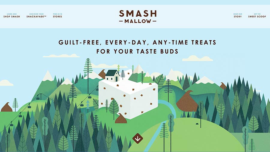
The web is littered with millions of stock photos, but more and more websites are beginning to make use of detailed, artfully constructed illustrations in place of traditional photography. Illustrations offer another way to communicate with site visitors. Information from your content can be tailored to an illustration. The imagery is easily branded and blends seamlessly with your overall company aesthetic. Vector-based illustrations offer even more opportunity, as animated illustrations and icons can grab attention and are a great supplement to the text.
Stock photography isn’t going anywhere, and will always have a place in design. But, using illustrations can give your site a one-of-a-kind appearance with images specifically curated for your business.
2. Typography
It’s not just about what you say, it’s how you say it! Typography as a visual element is certainly not a new trend. It has been standard practice in graphic and print design. In recent years, these typographic elements have made their way onto the web, with stunning results.
Bold Typography
Bold typography gives your information visual weight. Large, heavy typography can also be used as a design element in and of itself. We have seen this with sites that use text-only headers.
The single greatest advantage of bold typography is readability. Bold fonts create a lot of contrast and visual hierarchy. Bold typography is especially popular on mobile as it is clear and legible on smaller screens.
Retro or Handwritten Fonts
This type of typography can make you stand out from the sans-serif crowd. Retro style fonts can give your company a vintage look and feel. Handwritten fonts can create a notion of familiarity.
With any element, typography needs to be used with purpose. Bold fonts can create contrast and importance but if everything is bold, nothing is bold. Handwritten fonts can be expressive and playful but if type becomes too ornamental, clarity and legibility suffer. When figuring out the best font for your business, knowing how and when to use expressive design will make or break your site.
3. Gradients
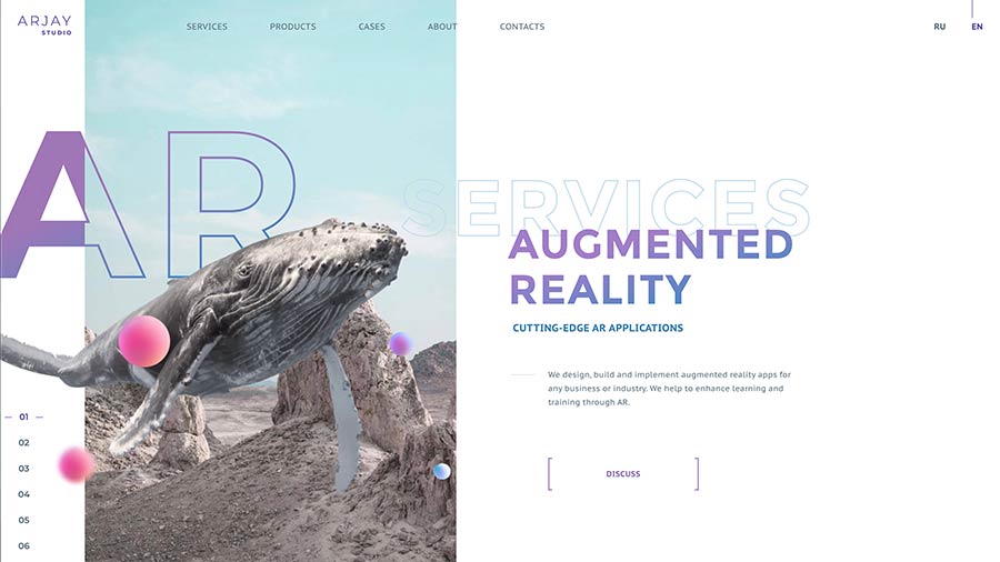
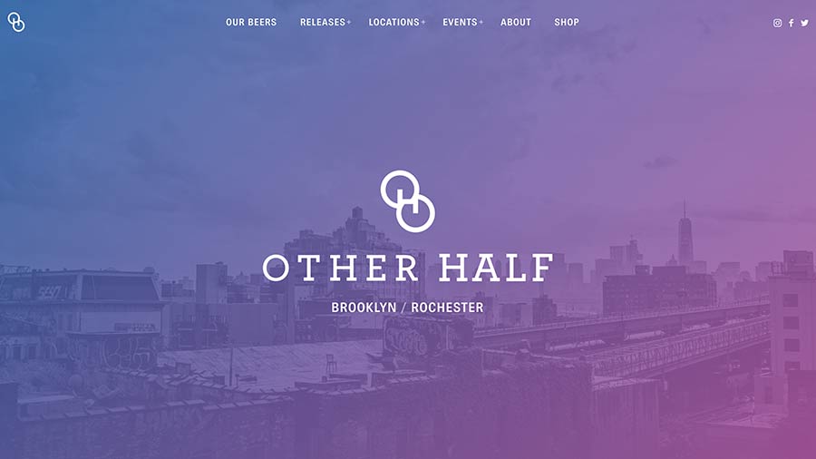
Ultra-minimalism has been a major trend for the last few years and continues to dominate the web landscape. Minimalism strives to reduce visual elements down to essential, functional objects. A byproduct of this approach is often excessive amounts of white space. This can lead to dull and almost colorless designs. One growing trend that fights this is gradients. Gradients add splashes of color to your site, creating strong accents to imagery and content. It also does this in a way that is less intrusive than photos and illustrations. Gradients can replace flat colors and create more depth.
Another useful function of gradients is their adaptability to screen sizes. Being resolution-independent, gradients look great on the largest desktop and the smallest phone.
Be careful when adding gradients. Used sparingly, this technique can create great pops of vibrant color or can use muted tones to fade into the background and make product shots pop off the screen. Used without care and intelligent thought, it can quickly become the stuff of nightmares!
4. Asymmetry
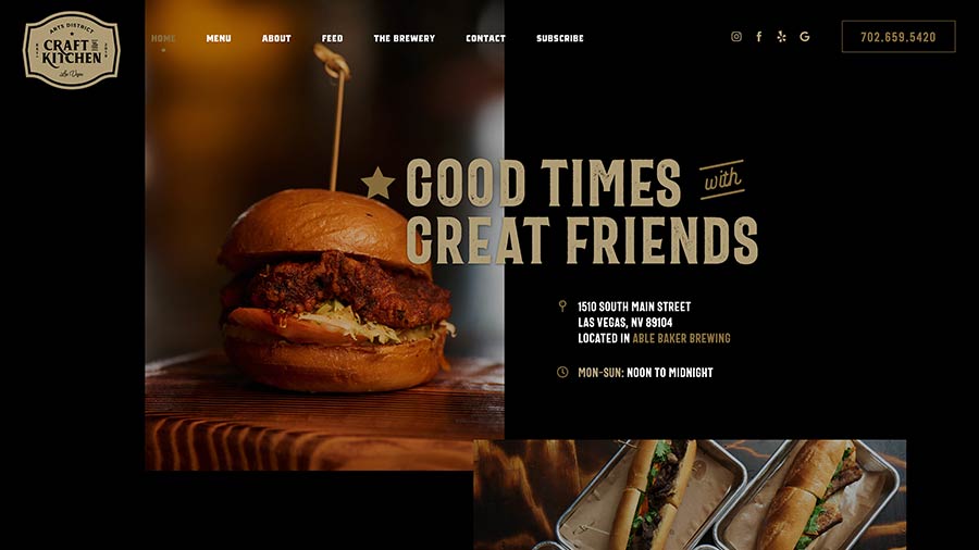
Another standard feature of recent website designs is card-based grids. Minimalism led to creating ordered, structured layouts to make content easier to consume. However – these grids threaten to box web design into overly structured, predictable layouts. This leads to the “same-y” look of many websites, today.
A fantastic way to break out of the box is to create asymmetrical layouts. Using blocks of color, textures, and imagery, you can create broken grids that still have a definite structure, but are free to break the boundaries of the grid. Text offset on top of images, blocks of color peeking out from behind your photos, and layered elements create a wonderful sense of depth.
Be careful! A broken grid still needs structure! Sloppy design is bad design, and bad design is never a trend.
5. Abstract & Geometric Shapes
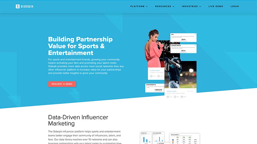
While we’re talking about asymmetry, another rising trend in web design is the use of abstract shapes. These simple and powerful design elements can be used to create more compelling compositions. Abstract shapes are commonly used as visual dividers between sections of page content. In addition to breaking up information, the shapes themselves can improve user experience. Angled section dividers can serve to lead the reader’s eye and pull them further down the page.
Geometric shapes, in addition to working well as background elements, can also add distinction when used as interactive elements on a website.
6. Tell Me A Story
At the end of the day, web design is a communications platform. Everyone in marketing knows that “content is king.” In recent years, web content has become more than just catchphrases, product information, and a list of services. More than anything, audiences want to feel connected. Whether it’s to their followers on Instagram, their friend groups on Facebook, or even the companies they purchase from; people want to be engaged.
“Your story needs to take potential customers on a tour of the aspects that step by step convinced you to believe so they can, step by step, come to believe the same things.”
– Annette Simmons
Today’s web audience isn’t looking for buzz words and fluff. Consumers are becoming more socially conscious. Content needs to be impactful and meaningful to engage them. Brand loyalty goes beyond just the product or service you offer. Does your business contribute to charities? Does your apartment community offer sustainable amenities? Does your product use healthy, locally-sourced ingredients? These are the kinds of things your potential customers are looking for. This kind of engaging content, that tells more about your company from a human perspective will engage users more than any charts and canned sales pitch.
It’s no surprise if while reading this article that you have remembered or thought of trends overlapping. No one trend is the end-all-be-all answer. This list is only scratching the surface of rising web design trends. All of these elements can and should be used together to create your overall web presence. What trends you decide to follow is up to you.
Above all — remember usability! Paint whatever digital landscape you want with your business, but make sure not to take away from the user experience.


